-

Inspection sampling made easy with AQL
The Acceptable Quality Limits or AQL is a sampling methodology used to help determine whether a batch should be accepted or rejected based on the maximum percentage of defective products that can be found inside that batch. The ISO 2859 standard (which is the internationally recognized standard for acceptance sampling in quality control and which…
-

How To Use Control Charts For Monitoring Process Variation
The Control chart is a type of graph that allows us to easily visualize the way a process changes over time and figure out whether this process is in control (the variation over time is consistent) or if it’s out of control (unpredictable, affected by special causes of variation). It might seem a bit more…
-

Discover Hidden Correlations In Your Data With The Scatter Diagram
The Scatter diagram is a type of graph that is used to visually represent the relationship (or lack of) between variables. We use this when we want to find out if the variables that we are examining are correlated (if there is any sort of relationship between them). A very important thing to understand is…
-

Spot Trends Easily With The Histogram
You might already know about this quality tool either from different fields or just from your general knowledge. The Histogram, at its core, is a visual representation of the distribution of quantitative data. The Histogram takes the shape of a bar chart, and the main component of a Histogram is what is called a “bin”…
-

Pareto Chart and the Law of the “Vital few”
My relationship with the Pareto chart has been a rather complicated one over the years, that’s why, unlike the other quality management tools that I sing praises to, you might find this to be a bit more critically reviewed. That is not to say that I don’t encourage using it, but I would emphasize the…
-

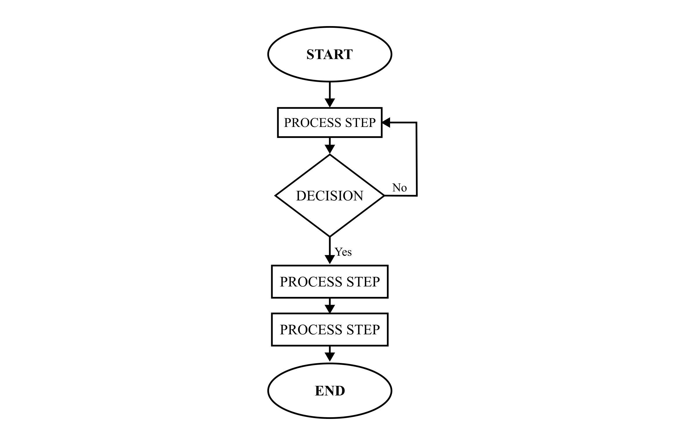
Visualize Your Process And Make Better Decisions With The Help Of The Flowchart
Like most quality tools, the Flowchart transcends the quality management barriers and is one of those tools that can be used in multiple fields. We can see frequent applications in software development, project management, education, sales, business process mapping, and so on. And chances are, you’ve most likely seen one of these around at some…