The Scatter diagram is a type of graph that is used to visually represent the relationship (or lack of) between variables. We use this when we want to find out if the variables that we are examining are correlated (if there is any sort of relationship between them).
A very important thing to understand is that correlation does not mean causation. Two variables can be correlated and not have a cause-and-effect relationship between them – it could be that another variable (third variable) is causing changes in the other two variables at the same time.
Here’s an example from Statology (and they have many other examples here) to better understand what this means: Say that we are looking at ice cream sales and shark attacks, we gather data and plot it on a Scatter chart and we see that these two variables are highly correlated. Does this mean that eating ice cream increases the chance of being the victim of a shark attack? Or could it mean that there’s a third variable that could influence both of these things? That variable could be, for instance, the temperature outside – the warmer the temperature gets, the more ice cream people consume, and they spend more time swimming in the ocean, thus exposing themselves to the risk of a shark attack. But buying an ice cream or consuming it, although correlated to the number of shark attacks, does not cause that.
Another thing we need to know before we can dive into its usage is that the tool uses two different types of variables – independent variables (represented on the X-axis) and dependent variables (represented on the Y-axis).
Independent variables are those that we don’t have control over in real life, OR,in a scientific experiment – are the variables that we do control to test their effect on the dependent variable. In our example from above, we cannot control the temperature outside so the temperature is an independent variable. If, for instance, we want to test if there’s a correlation between the temperature outside and an increased heart rate in a person working out, and we run this experiment in a lab, we could control the temperature of the room (in this case, the variable is still considered independent although we are controlling it to mimic outside conditions)
So how can we tell if our data is correlated? Very easily. First, we examine the shape of our graph and see if the correlation is obvious. Below are the main types of scatter diagrams
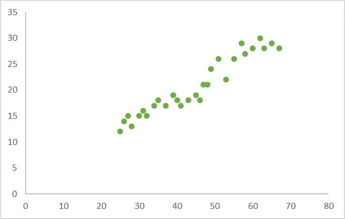
- If there’s a strong positive correlation between our variables (meaning that the value of the Y variable increases as the value of the X variable increases), the graph is going to look something like this:
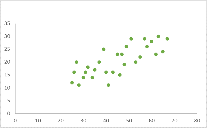
- If there’s a weak positive correlation between our variables (The value of Y increases slightly as the value of X increases), the graph will look something like this:
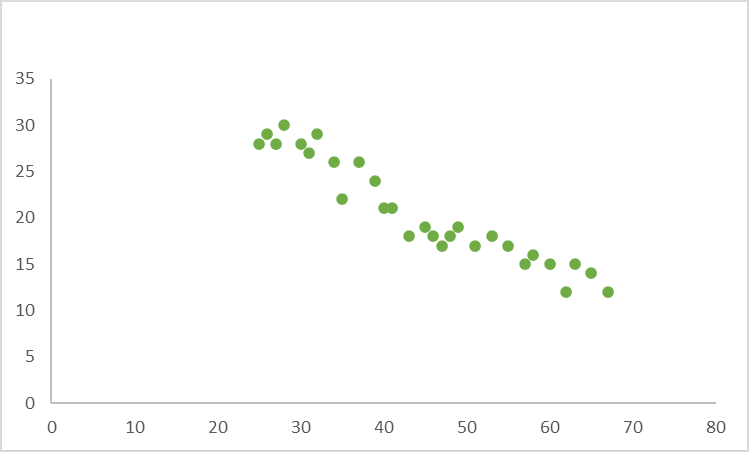
- If there’s a strong negative correlation between the variables (The value of Y decreases as the value of X increases), the graph will resemble this:
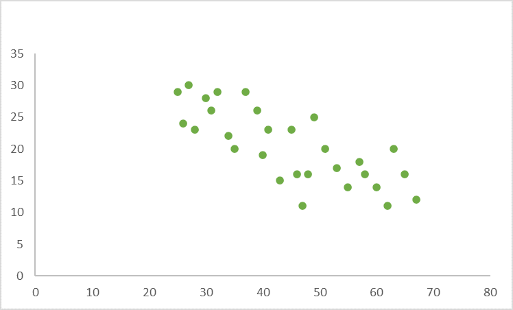
- If there’s a weak negative correlation between the variables (The value of Y decreases slightly as the value of X increases), the graph will look something like this:
- If there’s no correlation (Y does not seem to change at the same time that X changes), the graph will resemble the one below:
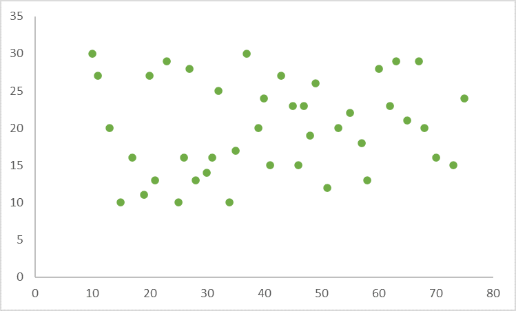
- If there’s a complex correlation (The value of Y seems to be related to the value of X, but the relationship is hard to determine), the graph will resemble the one below:
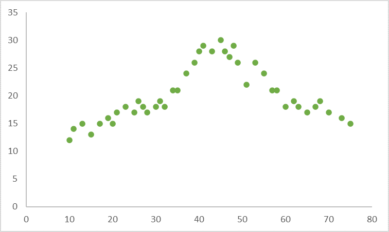
Now, once you’re done plotting the graph, if you can see patterns of points forming a line or curve then you can stop because the variables are correlated. At this point, you can use a regression or correlation analysis depending on what you want to do next (if for instance you want to show a cause-and-effect relationship between variables or you be able to predict the value of one variable based on the value of another one with the help of a formula, then you’ll run a Regression analysis.)
If that’s not the case, and you can’t tell for certain if there’s a relationship between variables by just looking at the graph then you would apply the methodology proposed by ASQ in their post, which was summarized here:
- Divide the points of the graph into four quadrants. We do this by dividing the total number of points (x) by 2 and then counting x/2 points from top to bottom and drawing a horizontal line, and x/2 points from left to right and drawing a vertical line. If the number of points is odd, then we would draw the line through the middle point
- Count the points in each quadrant (exclude those that fall on the lines from being counted)
- Add the diagonally opposed quadrants as follows
- A = points from upper left quadrant + points from lower right quadrant
- B = points from upper right quadrant + points from lower left quadrant
- Identify the smallest value from A and B and note this value as Q
- Add the values of A and B and note this value as N then check the limit of N on the trend test table (see one here)
- If Q is less than the limit, the two variables are related
- If Q is greater than or equal to the limit, the pattern could be the result of a random chance
So, let’s take the Scatter diagram where there doesn’t seem to be a correlation as an example. In this case, we have 42 total points so we’ll draw the horizontal and vertical lines at 21 points (42/2).
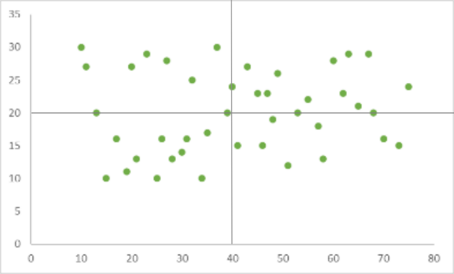
We then count the number of points in each quadrant and get the following results:
- Upper left quadrant points: 7
- Upper right quadrant points: 11
- Lower left quadrant points: 11
- Lower right quadrant points: 8
We add the values of diagonally opposed quadrants:
- A = 7 + 8 = 15
- B = 11 + 11 = 22
Select the smallest value between the two
- Q = 15
Add the values of A and B
- N = 15+22 = 37
And then we would have to check if our calculated limit is lower or higher than the expected limit from the trend table.
- For N = 37, the limit according to the trend table is 12. The value of Q in our case is 15 which is higher than 12 so the two variables are not related, and if our pattern does resemble a correlation, it is most probably the result of random chance
I know at this point, you might ask yourself, how can this tool help a company and the quality of its products and/or services?
As always, let’s take for example our tea manufacturing company. Our top priority thus far has been having the ideal moisture level for the tea leaves. For this, we could look at the drying process and see if the drying time and moisture levels of the tea leaves are correlated. If we see a correlation between the drying time and the leaf moisture level (for instance we can see a negative correlation suggesting that drying time reduces moisture content) we can then run a regression test to see if that’s truly the case, and, if so, we could then take action and reduce the drying time for the leaves. If we see no pattern that could indicate a correlation, we could start looking for other variables that could be affecting the leaf moisture levels, such as the temperature in the room, the leaf thickness, or even the humidity of the room.
The Scatter diagram was a great starting point to help us easily identify patterns and relationships between variables. If we also choose to run a regression analysis on our data, it could even help us determine causality and make predictions about what can be expected based on our input.

Leave a Reply