My relationship with the Pareto chart has been a rather complicated one over the years, that’s why, unlike the other quality management tools that I sing praises to, you might find this to be a bit more critically reviewed.
That is not to say that I don’t encourage using it, but I would emphasize the need to be careful when using it as I find it to be a tricky tool. On a scale from 1 to 5 (where 1 is very easy and 5 is very complicated), most quality tools would rank 1 for ease of implementation or usage, and this little bugger would be a 4 for me. Ok, so let’s break it down, and let me explain what this tool is, why I would use it, and how I would use it.
So, the story of the tool is a rather cool one, and it starts in 1906 when Vilfredo Pareto (an Italian polymath who contributed significantly to the field of microeconomics) observed how 20% of the Italian population owned 80% of property in Italy. This interesting relationship was then generalized by Joseph M. Juran into what would later be known as the Pareto principle or the 80-20 rule. Juran believed that 80% of a company’s revenue would come from 20% of customers and 80% of production problems would be caused by 20% of all sources of error.
Later on, in 2005, Juran coined the terms “vital few” and „trivial many” to refer to these two categories – the vital few (20%) that lead to the trivial many (80%). That’s how the Pareto principle started being used in quality management, as a strategic management tool that can identify the „vital few” that have a significant impact on the outcomes – addressing these „vital few” issues could then increase product quality more than fixing the „trivial many” issues.
So let’s look at how we would use this tool inside our fictional tea factory. For this example, let’s assume that we have noticed that in the past month, we have more customer complaints/or defects than usual. Since we are a small factory with limited resources that cannot fix all the problems/defects, we want to use the Pareto chart to help identify the vital few, the 20% of complaints/defects that lead to 80% of problems. For this, we will first gather these complaints/defects (at this point, if we had a checksheet we could just get the data from there).
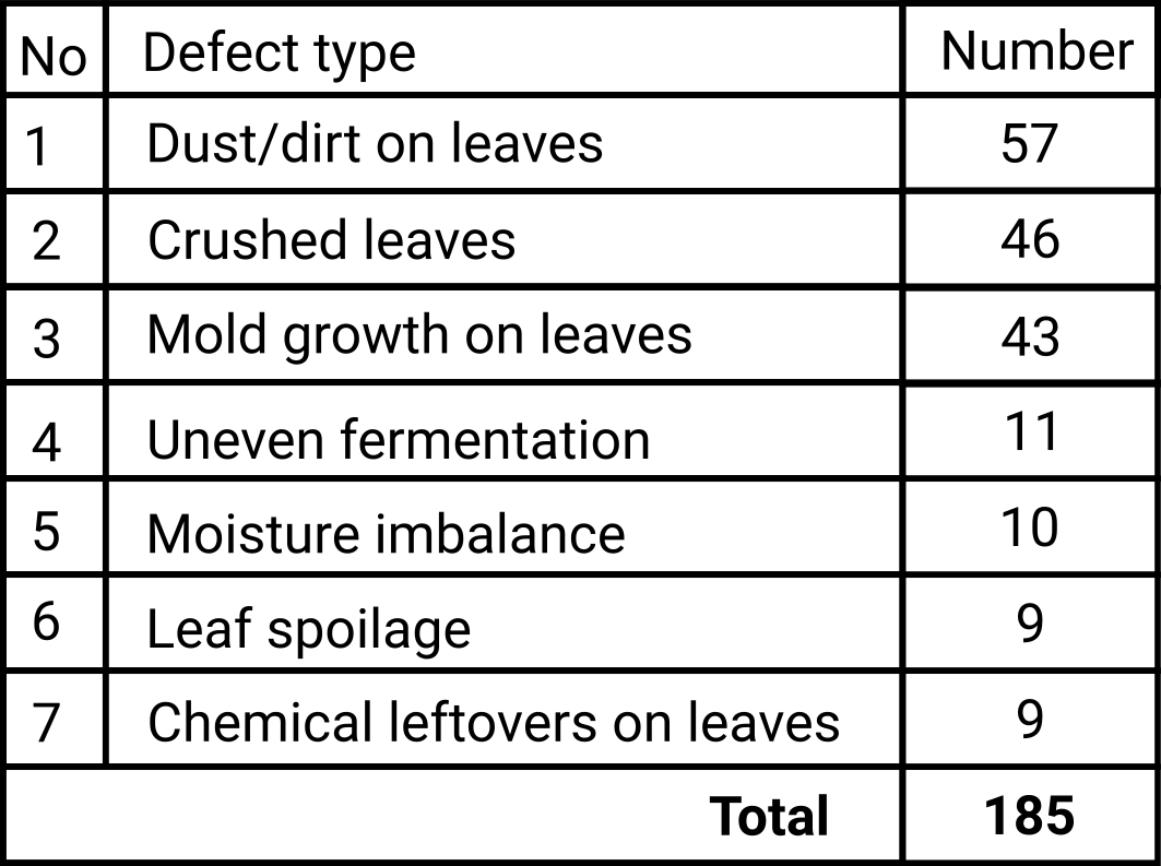
- Mold growth on tea leaves: 43
- Leaf spoilage: 9
- Dust/dirt on leaves: 57
- Chemical leftovers on leaves: 9
- Moisture imbalance: 10
- Uneven fermentation: 11
- Crushed leaves: 46
Now that we have the data gathered, we can either input it into software that can automatically generate the Pareto chart or (and this is what we’ll do in this case) we can manually build the Pareto chart. Since I emphasized how most quality tools are free, in this case, I will show you how you can singlehandedly build the Pareto chart.
The first step would be sorting the data into descending order based on the number of occurrences, as you can see in the table below.
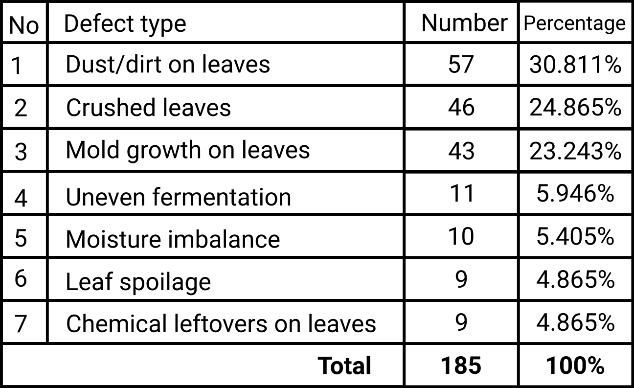
The next step would be to calculate the weight of each type of defect from the total as shown below.
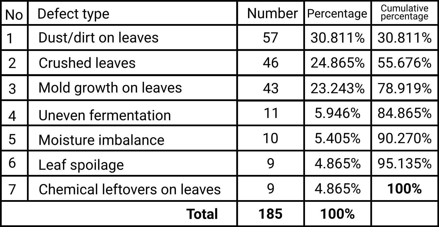
Then add another column with the cumulative weights (by simply adding the value of the previous weight to the current one)
All left to do is create the Pareto chart and represent the data on it. For this, we will start by drawing on the left axis the maximum number of defects registered (maybe even a bit more so the graph will look better), then draw the bars for each category of defect, and then draw the points for the cumulative percentage at each type of defect and connecting the points.
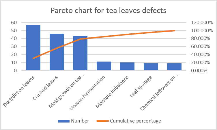
Now that we have the Pareto chart, the only thing left to do is to see where the 80% line is reached and we can observe that roughly, the point of the third type of defect intersects this line. Good, so then we know that the „vital few” defects in this case are the: Dust/dirt on leaves, Crushed leaves, and Mold growth on tea leaves. These are the „vital few” defects that cause most problems and solving these would benefit the most.
So far so good right? So what’s wrong with this then?
I encourage you to take a couple of minutes to look at the chart, and the data and try to see where this tool may fall short before I’ll point it out.
So assuming that you’ve done that already, here we go:
- The first and foremost problem I see is this: Why would anybody need to run the calculations and draw the chart when it’s obvious from looking at the data (once it’s sorted in descending order) that the top three defects will reach the 80% line? An obvious reason for someone (think about a company with a certified quality management system) to create a Pareto chart can be that it can provide traceability and help document the decision-making process. Another possible reason might be to verify if there is indeed a Pareto relationship or if, the 80-20 rule applies to the data that we have. We must remember that the Pareto principle is not a mathematical law and therefore we shouldn’t take it at face value and rigidly apply it. The Pareto principle is more than anything an observation of data.
- Unless you are very careful of what you measure, the Pareto chart will not help, and in fact, may make matters worse. Here’s what I mean: Let’s look at our Pareto chart and think about what it means. So we had an increasing number of defects in our production process and perhaps we even had an increasing number of customer complaints. We gather data about the type of defects that are registered in the production process, we make the Pareto chart and we are delighted that we have a Pareto relationship because we know that now all we have to do is make sure that the employees (or machines) responsible for the first three types of defects (Dust/dirt on leaves, Crushed leaves, and Mold growth on tea leaves) pay more attention or, in the case of machines, are properly calibrated. Great right? But what if our customers are not as concerned about crushed leaves (in fact they might not even notice that) as they are about chemicals on the tea leaves? We decided (based on the Pareto chart) that that defect type is not a priority since it’s part of the „trivial many”, but it may be far more important than all of the „vital few” defects in this case. Just imagine the backlash our company could face if one or multiple customers end up in the hospital due to the chemicals on our tea leaves. And that’s why, it is essential to factor these aspects in, and in most cases, we do this by creating what’s known as a Weighted Pareto Chart.
The main idea of the Weighted Pareto Principle is to take into account and emphasize what matters mostly. For our case, for instance, instead of building the Pareto chart for the number of defects, we would focus on the importance of defects. We do that by adding a new column with grades 1-5 or 1-10 or whatever you decide the thresholds should be. In this case, let’s say that we have a 1-10 scale where 1 is not important at all and 10 is very important. We would then talk with the employees or even the customers and ask them to rate each type of defect. Let’s assume we did that and this is the result:
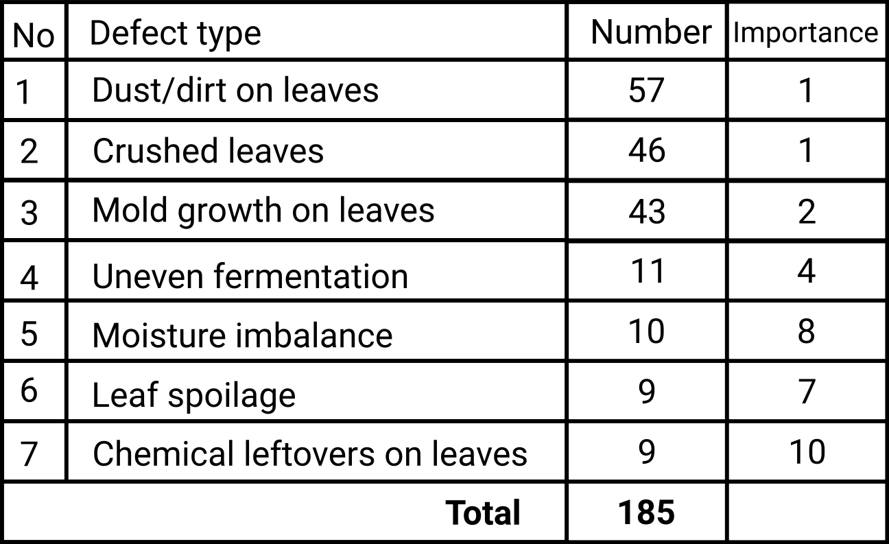
Next, we would have to figure out the value of the defects and build the Pareto chart based on that.
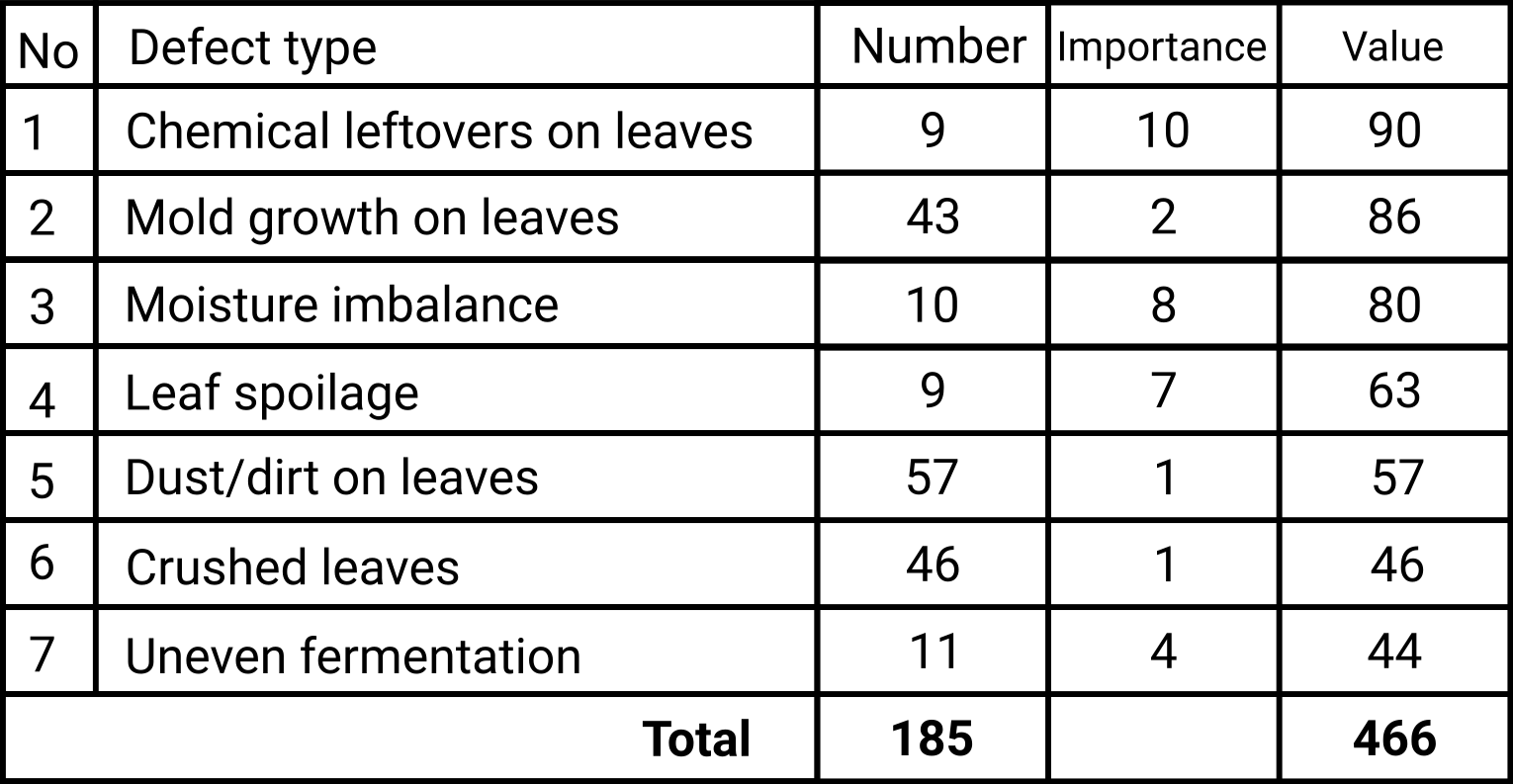
We can already observe that the „Chemical leftovers on leaves” defect is now the first with a much higher value than the „Dust/dirt on leaves” defect. Looking at this data, at the higher values, we would be tempted to say that the first three types of defects („Chemical leftovers on leaves”, „Mold growth on tea leaves” and „Moisture imbalance”) will reach 80% line and therefore these are the „vital few” defects that need to be solved. But let’s see what happens once we run the calculations and build the Pareto chart.
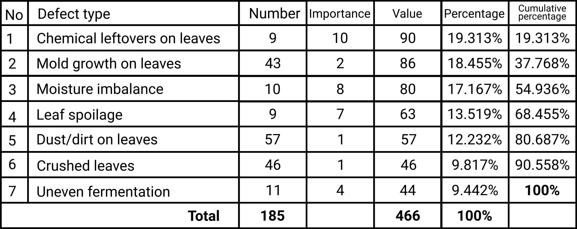
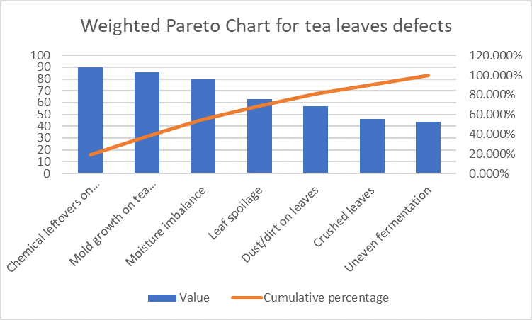
Now that’s interesting, isn’t it? What you see here is a lack of a Pareto relationship. The 80% line is reached at the 5th type of defect, which means in this case, there are no „vital few” defects, from this perspective, the first five categories of defects (so 71.42%) of defects cause 80% of complaints.
And this is precisely why I encourage you to use the Pareto chart but be very mindful of the data that you’re gathering and what you’re using it for, and most importantly, always make sure that you’re measuring what matters.
There’s a beautiful example of how the same data can lead to different conclusions depending on what you choose to observe in this article that I strongly encourage you to read if you want to find out more about the Weighted Pareto Chart (https://blog.minitab.com/en/understanding-statistics/explaining-quality-statistics-so-your-boss-will-understand-weighted-pareto-charts).
So yes, that’s the reason why I would rank the Pareto chart as a bit more difficult quality tool, but please, do not shy away from using it if you feel it could bring you benefits. And let me know if you have another take on the application and usefulness of this quality management tool.

Leave a Reply