The Control chart is a type of graph that allows us to easily visualize the way a process changes over time and figure out whether this process is in control (the variation over time is consistent) or if it’s out of control (unpredictable, affected by special causes of variation).
It might seem a bit more complicated than it is, but just bear with me, please. Pour a slightly bigger cup of tea for this blog post.
Why is the type of variation important anyway? You might ask yourself. Here’s why: because no two products will ever be identical – some small variation will most likely always be present. These variations can be the result of variations in the material used, the environment, the way the machines operate, the employees, the tools we use for measuring the resulting product, and so on. Some variation is ok, but generally, if we want to produce good quality goods we must keep this variation to a minimum. There are two types of variation:
- Common-cause variation – which is present to some extent in all processes, and is the result of natural variability in inputs to the process and its operating conditions (think small changes in the temperature or humidity of the environment, slight differences in the composition of raw materials, and so on). Adjusting the process in response to each deviation from the target when only common cause variation is present increases the variability in the process
- Special-cause variation – is unusual, unexpected variation. It is usually caused by specific events and changes in the system (think sudden failures on machines or tools, operator mistakenly using incorrect settings on a machine, environmental shocks, and so on). This type of variation requires investigation and identifying the root cause as quickly as possible.
The stability of a process allows us to predict the range of variability that is to be expected in the product/s in the future. This allows us to develop systems that can cope with that level of variability.
We say that a process is in control if the distribution of the X characteristic appears to be statistically stable. We can have a process that is in control but does not yield the results we want, or the results expected by the customer (and we’ll talk about specification limits for that)
So why would we even care about all of this? Well, let’s once again take our little tea factory as a case study. Let’s say that our production process yields tea leaves with an average moisture of the tea leaf of 3.05% which is ideal. Our main goal was to have tea leaves with a moisture content of 3% but 3.05% is ridiculously close to that and more than acceptable. Now and then, however, we notice a tea leaf slipping in the production process with a humidity level of 3.10% – the employees say this is rarely the case. Another time, while doing random checks in production, we found a tea leaf with a humidity level of 3.98% – truly worrying. The employees said that the drying oven was malfunctioning that day and the leaf would have been reintroduced for another round of drying. At this point we might be wondering: Is our process truly, ok? Was it just a one-time oven malfunction or is there something more?
By not doing anything about it we might be overlooking an important signal from our process that things are going south. On the other hand, reacting immediately and taking action against these issues that we identified might lead to an overcorrecting of the process (which could be perfectly fine, case in which, our corrections might affect the process in a bad way). And that’s exactly where the control chart steps in to save the day. Control charts allow us to visually monitor process stability, detect process issues early on, distinguish between common and special causes of variation, and reduce overcorrections. More than this, the control chart can provide great decision-making support (rather than relying on assumptions and isolated observations we can rely on objective evidence obtained from the process itself)
Why not just control the process with even the smallest variation? Walter Shewhart – the inventor of the first control chart, noticed that if there’s tampering with a process that only has random variation, this will only make it worse and introduce more variability. And that’s why we avoid controlling the process as soon as the smallest variation is identified.
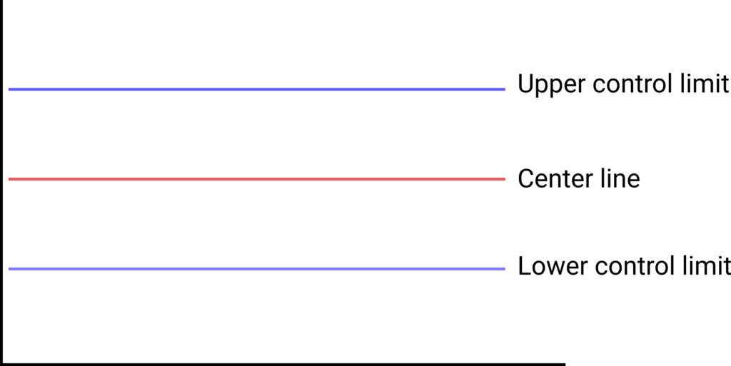
Although there are different types of control charts, each useful for a different scenario, all control charts have three main components. The main data represented on any type of control chart has an upper control limit, a lower control limit, and a center line for the average (like in the figure below).

These lines are determined based on past performance of the process and can provide a comparison basis for current values in the production process. Yes, you read that right, the lines are determined based on the past performance of the process and not the specifications or customer requirements.
So, you might be asking yourself: Is it possible to have a process that is in control and yet doesn’t produce products that are following customer specifications? Absolutely! The fact that a process is in control only means that we can rely on it to perform as it has in the past and to produce the same results with some very slight variation. If, however, we set some parameters different than customer specifications, the process will consistently produce products that have very small variations but aren’t following customer specifications. The thing is, for a process that is controlled, as soon as we adjust the parameters accordingly, and we set all tools and machinery to produce goods that are according to customer specifications, we can rely on the fact that it will consistently produce products that meet those requirements (but we’ll talk about this subject a lot more at the post about the capability analysis). Control charts for variable data are used in pairs with the top chart monitoring the average, or the centering of the distribution of data, and the bottom chart monitoring the range or the width of the distribution.
The basic procedure for a control chart construction consists of 4 simple steps:
- Choosing the appropriate control chart for the data
- Determining the period for data collection
- Collection of data, construction of the chart (by establishing the upper and lower control limits and the center line), and plotting the data
- Analyzing the data and identifying out-of-control signals
You might notice the first step is “Choosing the appropriate control chart for the data” and you might also wonder what that means. Well, depending on what you plan to monitor (e.g. is it the dimension of a product? the consistency? whether the products resulting from the production process are defective or not?) two main categories of control charts can help you:
- Control charts for continuous data. These charts register data that can take any value within a range (e.g. time, weight, length, temperature). There are three main types of control charts in this category:
- Xbar R charts (Xbar-Range charts) are commonly used for continuous data when we have small subgroup sizes (more than 2 but less than 10) and they can help determine the consistency of the process averages and the ranges within each subgroup;
- Xbar S charts are used to examine the process mean and the standard deviation over time. The S chart is considered to provide a better understanding of the spread of the subgroup data than the R chart. These charts are used when the subgroups have larger sample sizes (more than 10)
- Individual and moving range (I-MR) is one of the most common control charts for continuous data. These charts are recommended when the natural subgroup size is unknown, the data is scarce (therefore subgrouping is not practical), the natural subgroup lacks definition, or when the integrity of the data prevents a clear picture of a logical subgroup. These charts monitor the process average and the process variation but they are applicable for a single data point over points in time.
- Control charts for discrete data. These charts register countable data (e.g. number of defects, number of occurrences within a sample, number of pass/fail rates). There are four main types of control charts for this category:
- The p-Chart, commonly used for registering the proportion of defective units in a process
- The np-Chart, used for monitoring the number of defective items in a sample (and each unit can have multiple defects) when the sample size is constant
- The c-Chart, commonly used when we want to identify the total count of defects per unit when the samples in each sampling period are constant
- The u-chart, used to monitor the average number of defects per unit when the sample size is not constant (the number of samples of each sampling period varies significantly)
Still not sure which charts to use when or want an easy visual way to remember this info. Check the useful flowchart provided by this article from Sixsigmastudyguide
After choosing the type of control chart to be used, and plotting the data, it is easy to spot if a process is in control (stable) or out of control (unstable) as can be seen in the figure below, where the process on the left side is stable and the one on the right is unstable.

As always, let’s jump to an example of using a control chart inside our fictional tea factory.
For this example, we want to monitor the humidity of tea leaves to make sure that these don’t develop mold (which would normally start happening over 5% humidity levels), and see if the drying oven is functioning in normal parameters (say we set it to dry the leaves to a humidity level of 3%±0.5%). In our factory, the humidity of the tea leaves is measured with the help of a tool called moisture meter which is a fast and non-destructive way of measuring the humidity.
Next, we have to decide on the control chart that’s best suited for our needs. Since we have continuous data, we know we will select an Xbar or I-MR chart, and since data measurements are done in a non-destructive way we could opt for selecting large sample sizes and creating an Xbar S chart, but for the sake of keeping the example simple, we’ll consider that the quality engineers think that it’s enough to work with small sample sizes (<10) and therefore we’ll use a Xbar R chart.
The quality engineers also decided to gather samples of 6 tea leaves every hour for a day (again, for simplicity’s sake, let’s assume that our tea factory works with just one shift so that’ll be 8 hours in the workday and therefore 8 samples). An important thing to understand is that a sample of 6 tea leaves is a subgroup and we have 8 subgroups (k=8 subgroups of size n=6). This will come in handy later when we’ll run the calculations.
So now our first two steps of the control chart construction have been completed: we decided which type of control chart to use for the data that we want to collect and the period for data collected. We can now move on to the next stage, which is collecting the data, constructing the chart, and interpreting the results.
The data that we collected can be seen in the table below:

Next, we look at what data is necessary for the control chart construction. We know we need the upper and lower control limits and the central line and the formulas for those are:
For the Range chart upper and lower control limits

For the Xbar chart upper and lower control limits

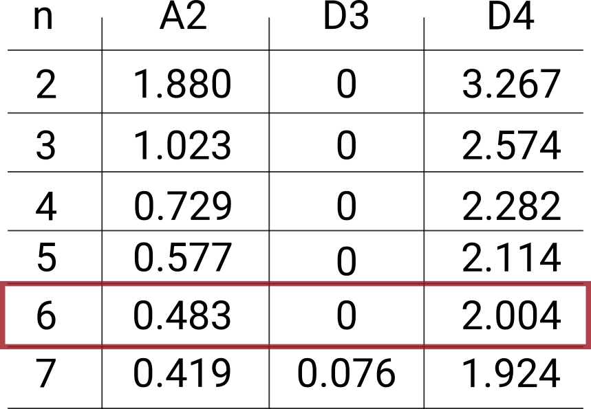
The values of the A2, D3 and D4 constants can be found online if you search for control charts constant (again, for simplicity’s sake I will not go into details about why we use these constants and how you can calculate and not estimate control limits – that’ll be the subject of a different blog article)
Here’s an excerpt from the table for the values that we are interested in

All that’s left is for us to start making the necessary calculations and then plot the chart.
We’ll start by calculating the average (the Xbar) for each row of our table.

And then the average value of these averages (the double-barred X)

Followed by the Range mean (Rbar). We do this by first calculating the Range value for each row and then averaging these results.


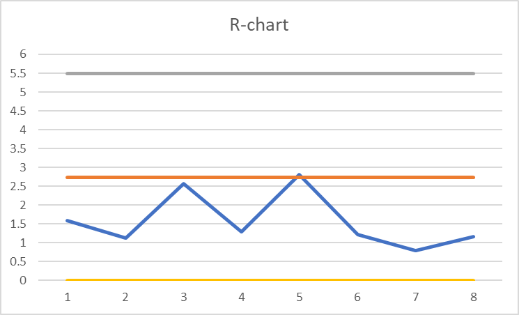
Now we can calculate the upper and lower limits for our charts


Great news! It seems that our process is in control and there’s no reason to worry. We can continue to monitor the process for the next couple of days or weeks by continuing to plot the data gathered directly on the chart (without having to calculate the upper and lower control limits all over again – unless we change the parameters of the oven).
The even better news is that you don’t have to run these calculations by hand as there are plenty of software programs that’ll automatically generate a control chart based on the data provided by you. If the budget is tight, the control chart can be generated with the help of basic tools such as Excel.
I hope this blog post helped you understand the power of control charts and how they can be used to help monitor processes – whether these are big or small, complex or simple.

Leave a Reply