You might already know about this quality tool either from different fields or just from your general knowledge. The Histogram, at its core, is a visual representation of the distribution of quantitative data. The Histogram takes the shape of a bar chart, and the main component of a Histogram is what is called a “bin” or “bucket” – this will contain the total number of values that fall within the interval of the bin.
The Histogram is useful because it provides a rough sense of the density of the underlying distribution of data and helps estimate the probability density function of the underlying variable.
Below are a couple of histogram shapes along with their significance
- Normal distribution

The “normal distribution” is a common pattern and it looks like a bell-shaped curve. The main idea for this shape is that it has data points occurring on each side of the average.
- Skewed distribution

This distribution is asymmetrical, with the distribution’s peak being off-center towards the limit and a tail stretching away from it. In most cases, this occurs when a natural limit prevents outcomes on one side.
- Bimodal distribution

The bimodal distribution is the result of combining the outcomes of two processes with different distributions in one set of data. This type of distribution is also sometimes referred to as “Double-Peaked”
- Multimodal distribution

The multimodal distribution shows the peaks of the data points close together, as a result of several processes with normal distributions which are combined. This distribution is sometimes referred to as a “Plateau” distribution due to the top of the distribution resembling a plateau
- Edge Peak distribution

This distribution resembles the normal distribution except for the large peak present at one edge of the distribution. This is most usually the result of a faulty construction of the histogram.
These are just some of the most common types of distributions for a Histogram. More examples of distributions can be found at: https://asq.org/quality-resources/histogram
One very important thing to note is that you should make sure that the process from which you gather the data for the Histogram is operating in normal conditions at the time when it’s analyzed to get an accurate representation of the process.
The steps to building a Histogram are very simple and intuitive.
- We start by gathering a minimum of 50 data points
- We then calculate the range of the sample (as the difference between the highest and lowest value in the sample)
- We determine the number of bars that the Histogram will have by calculating the square root of the total number of data points
- We determine the Width of the bars by dividing the value of the Range variable by the number of bars
- We determine the edges of the bars by adding the value of the Width to the lower edge of each subsequent bar
- We then draw the x and y axes on the graph, add the bars and the values for each bar then interpret the data
So, I know it might sound tricky but as always, here’s an example to help show how easy this is. For today’s example, let’s say that we want to monitor the leaf moisture content for our tea leaves at the end of the drying process (let’s assume in this case that the ideal moisture content for the tea leaves is 3%). And let’s follow the steps described above to make it extra simple.
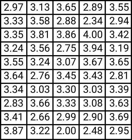
Step 1. We will begin by gathering at least 50 data points from the production process. So, let’s assume that we’ve done that and put the data in the table below.

moisture levels)
Step 2. We must calculate the range of the sample; let’s call the variable that will hold this value “R”, and since we know that the range is the difference between the highest and lowest values in the sample, we can write that as “R=Vmax –Vmin” where V is the assigned symbol for the values (the data points). In our case, the maximum value (Vmax) is 4 and the minimal value (Vmin) is 2. So, in this case, R = 4-2 = 2
Step 3. We will determine the number of bars as the square root of the number of values. The number of bars in our case would then be the SQRT(50) = 7.07. Of course, we have to round up this value. In this case, let’s assume that we decided to go with 7 bars.
Step 4. We will determine the width of the bars by dividing the value of the Range (R) by the number of bars that we decided to have (7 in this case). Width = 2/7 = 0.28
Step 5. We will determine the edges of the bars by adding the width value to the lower edge.
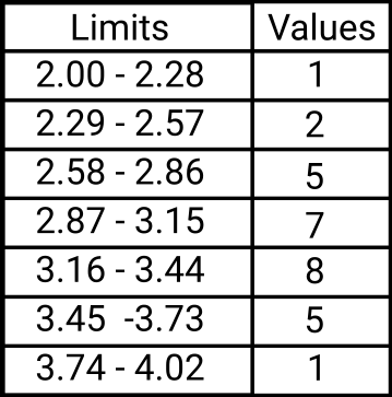
- The first bar would start at 2 (that’s the smallest value we have) and end at 2.28. That’s 2 (the lower edge) + 0.28 (the calculated width)
- The second bar would start at 2.29 and go until 2.57
- The third bar would then start at 2.58 and end at 2.86, and so on for all 7 bars.
Now, I know you must probably already know this but I still want to make sure and be thorough with my explanation so here it goes: the reason we start each new bar at the end of the previous one + 0.01 is to make it easier to determine which values fall where. Say we didn’t do this and then our first bar would be from 2 to 2.28; the second one would be from 2.28 -2.56 and the third would be 2.56 to 2.84. So how would we decide where to count the values that fall right at the edge? Say we have 3 values of 2.56, do we count that in the second or third bar? Adding a 0.01 to the beginning of the next limit helped us fix this easily.
Step 6. All that’s left is to draw the graph, and for this, we will also need to know how many values fall in each bar interval. So, all that’s left to do is to look at the data and see how many values fall in each bar. I’ve done this already and the results are in the table below.

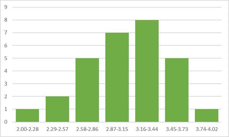
Now that we know our maximum value for these values, we can draw our graph to one value above that (just so that it looks better) and add the bars for each interval. On the x-axis, we will have the bars with their limits, and on the y-axis, we will have the values for each bar.
Let’s look at the example below and see what shape our histogram resembles if any at all. In our case, the Histogram seems to have a normal distribution shape, which is great news since our ideal moisture for tea leaves was set at 3% and we can see that while there is some variation in moisture, most values are between 2.87 and 3.44.

Now I know you might be thinking, that while it is not hard to use this quality tool, it can be tedious work – running all the calculations, identifying the maximum and minimum values, counting the values for each bin, and so on. In our case, this was somewhat easier because we only had 50 data points, but for more accurate results you will most likely gather more data, and honestly, even just finding the minimum value in a range of say 300 data points can be overwhelming.
But do not despair, nobody says you can’t use tools to help you, and also nobody says you have to buy fancy software to do this. This is easily doable even with something basic like Excel or a free alternative such as Libre’s Calc – these tools can help you find the maximum and minimum value, calculate the number of values in each interval, and then even draw up the histogram for you.
Please let me know if you would like me to do a tutorial to show you how easy it is to use these tools to create a Histogram in less than five minutes.

Leave a Reply