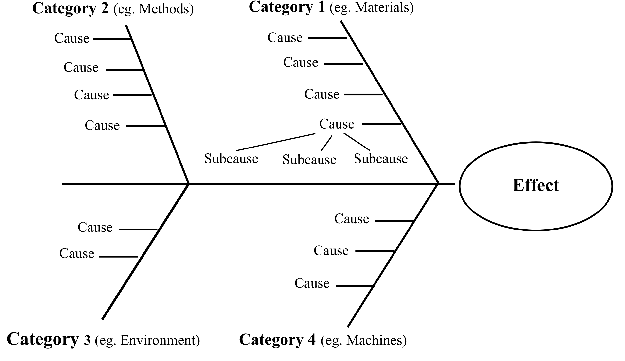
The Fishbone diagram, also known as the Cause and Effect or Ishikawa diagram is a quality management tool that allows you to quickly identify, visualize, and organize “causes” or “problems” that can lead to an effect. The diagram was developed by Kaoru Ishikawa and first presented in 1945 as a tool for analyzing the causes of problems within quality management.
I know at this point you might be thinking, why is that so important and why should I care? Here’s why:
As humans, we often look at problems and either:
- Tend to identify and solve the first issue that we think caused that problem;
- Miss out important issues that could’ve caused the problem;
- Get overwhelmed by ideas and possibilities of what could’ve gone wrong and it breeds chaos in our decision-making process.
Either way, no matter which one of these cases we find ourselves in, one thing is clear… we’re quite in a pickle, aren’t we? Each one of those cases results in us solving a problem that we can identify rather than the real problem. Furthermore, in the case that we find ourselves in the last scenario, chances are we’re going to experience some good old analysis paralysis, or just be sluggish and delay making a decision regarding the problem that needs to be fixed.
And that’s where this tool shines. But let’s look at an example before we talk more about it.
Let’s take a simple example. Let’s say that I’m unhappy with the quality of the tea that I’ve been brewing lately, particularly, the fact that it seems to taste bad. The problem that we would apply the fishbone diagram for in this case would then be “Tea tastes bad”, which would be written to the far-right side, where the “head” of the fish is represented. We would then start thinking about what about the tea itself could cause it to be bad so that we could say, there’s a problem with the ingredients such as we have low-quality tea leaves, we have stale or old tea, there are impurities in the tea leaves, or maybe we have bad water. We could then go a step further and ask, what makes the water bad? Well, it could be that we are in a region where there’s hard water, heavily chlorinated water or it might be contaminated. We could then look at the equipment that we’re using, the methods used, and the environmental conditions. These (the ingredients, the equipment, the methods, and the environment) are the main categories, and in each category, we can have one or multiple causes, we can have none, one or multiple secondary causes.
To make it even easier to understand I’ve created the fishbone diagram and completed all of the other categories with their causes and sub-causes.

To clarify furthermore, in this case, “Ingredients” is the category of causes, “Bad water” is a main cause, and “Chlorinated water” is a secondary cause.
Now that you’ve gotten a sense of how it looks and works, let’s clarify some aspects and then talk a bit more about why it’s useful.
- An important thing to note is that you don’t have to pick a category and stick to it until you’ve exhausted all the potential causes. Depending on your style, you can jump from one category to another and add things or eliminate things as you go along.
- If you have a hard time identifying the main categories you can either use the generic headings suggested by the ASQ (American Society for Quality): Methods, Machines (equipment), People (manpower), Materials, Measurement, Environment or write down the main causes (and if it’s the case the secondary ones as well) then look for ways to group them into categories (this by the way is the main idea of the Affinity diagram which is another quality tool that you can read about here).
- Don’t feel pressured to have a certain number of causes, to have secondary causes, or, on the contrary, don’t despair if you have too many causes. Similarly, don’t try to follow templates for categories of causes if those don’t work for you. Remember, this tool is merely here to give you a clear, well-structured overview of your problem and therefore, just like each problem is unique, each fishbone diagram will be unique. All the templates and tools on the internet (you might encounter the 5M’s used in manufacturing, templates for fishbone diagrams used in product marketing, service industries, and so on) are merely there to give you a starting point and not force you into patterns that make no sense for you or your company.
The fishbone diagram is important because:
- It helps identify as many causes or problems as possible;
- It provides a structured way for teams to brainstorm;
- Within a team, it can encourage collaboration;
- It provides a visual representation which makes it easier to understand the causes and prioritize them;
- It can serve as documentation of the problem-solving process and can be referred to later for analysis and continuous improvement;
- It helps in process improvement by highlighting inefficiencies, bottlenecks, or areas where errors are likely to occur;
- It can be used in strategic planning to identify potential challenges and risks, allowing the company to prepare and mitigate these issues proactively.
And if you think this tool can only be useful inside a company, or a manufacturing process, think again, for in this article we used it for the case of me just trying to brew a better cup of tea.
PS: Just for the very slim chance that you reached the end of the article and didn’t figure out why it’s called a fishbone diagram, it’s because of the way it looks, with the problem or the effect being the head of the fish and the causes being the bones.

Leave a Reply