The Affinity diagram (also known as affinity mapping or the K-J Method) was created in 1960 by Japanese anthropologist Jiro Kawakita and although it may seem simplistic, don’t let that convince you that it’s also not incredibly useful.
The diagram is useful whenever one is confronted with a large amount of data and/or ideas (like perhaps at the end of a brainstorming session) that may seem chaotic and unrelated. This tool allows us to create order by categorizing items (ideas) based on logical and natural relationships between ideas. It is also a very useful tool when dealing with issues that seem too large or complex to grasp.
Like I always say, things are easier to understand when you use an actual example so let’s jump straight to that. Let’s consider that we’re a tea manufacturer, and lately, we’ve been receiving complaints from customers that the tea that we shipped was not as qualitative as it usually is. Now, some customers might say more precise things such as: “There were bits of dirt among the tea leaves”, or “The packaging was not properly sealed”, while others might give us more abstract indications such as: “The tea smelled different from usual”, some customers might not even say anything at all. Since we care about the quality of our product and our customers, we’ll want to get to the bottom of it as quickly as possible. We are also aware of the fact that our employees are the ones who hold very valuable knowledge and experience and can help us understand what happened. For this, we will organize a brainstorming session and try to identify as many causes that could’ve led to this problem as possible.
Fast-forward to the end of another long but hopefully fun meeting, and we have these ideas gathered from the participants:
- Poor quality leaves
- Inconsistent fermentation
- Misleading information
- Use of materials that alter tea flavor
- Incorrect blend ratios
- Poor transportation conditions
- Over-drying
- Improper storage of tea leaves
- Contaminated leaves (pesticides, dirt)
- Uneven drying
- Under-drying
- High humidity
- Incorrect storage temperature
- Non-airtight packaging
- Inconsistent blending
- Non-compliance with food safety regulations
- Incorrect fermentation time
- Incorrect labeling
- Lack of quality control checks
We might feel a bit overwhelmed by just looking at all the suggestions, and we might even feel like there’s a lot of stuff we need to fix with our operations (and for good reasons) to offer a more qualitative tea. I mean, there are so many things that went wrong, so how do we decide where to start? And how to go about it. Can you guess what could make it easier? Well, it sure would help to understand the main categories of issues we’re dealing with and need to focus on because then, it would be a lot easier to assign these to the responsible parties accordingly.
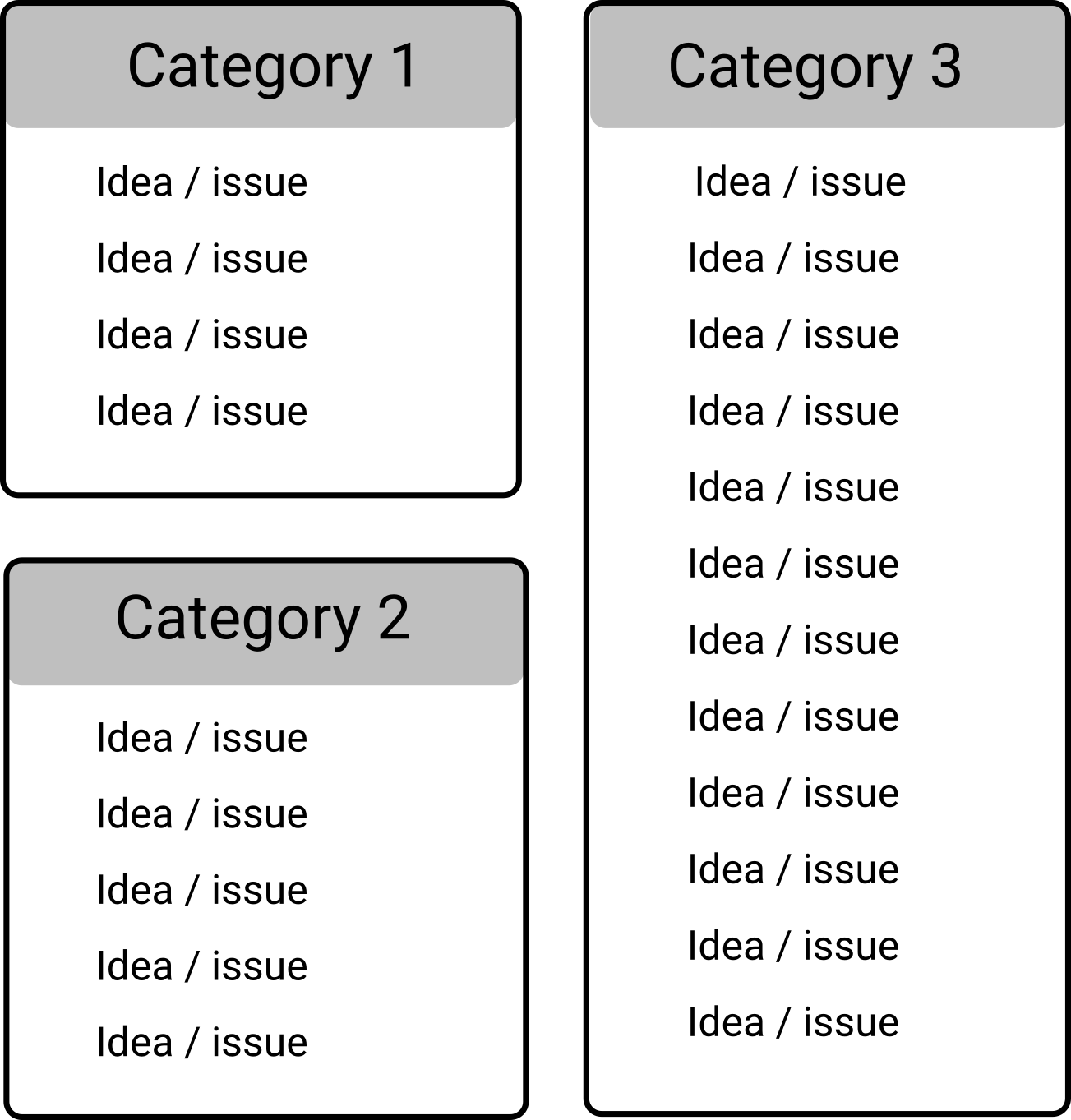
And that’s exactly the point of the Affinity Diagram, to help you sort and link all of these issues (or ideas) in categories.
Now the most common way of doing that is by writing out the ideas on cards (or sticky notes) and then arranging and rearranging them into groups until you start to see some common denominator for them.
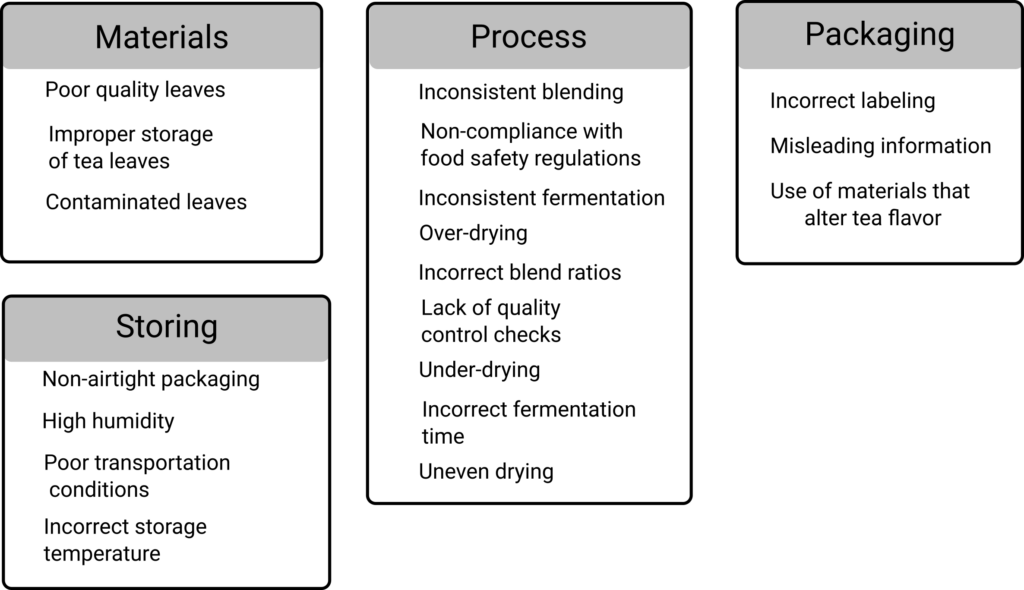
So, let’s pretend that that’s exactly what we did with all the ideas that we gathered, and we came up with the following categories (you can see these in the image below). Seems pretty logical, huh?

As you can see, sorting these ideas into categories allows for a clearer overview of the problems, and it makes it easier to notice some important things, such as how most of the problems that we’re facing arise from the process itself, and less from materials, storage or packaging. This, of course, can also help us organize further meetings with the departments or responsible parties for each case and find solutions to the problems that have been identified.
Now just because in this case we applied the Affinity diagram to solve a problem that doesn’t mean that that’s the only thing it can be used for. The Affinity diagram can also be very useful when dealing with creative tasks and coming up with ideas, or it can also be useful in project management for grouping tasks or other things.
Truly, the potential of this simple yet incredibly useful tool is almost limitless. The only way to make sure that something works for you or not is to try it, so I highly encourage you to try and incorporate this into your tool set and see how it can help you.

Leave a Reply